|
Techniques: Tutorial for Deep Sky processing | |
| HOME Best Lunar Planets Deepsky Misc Equipment Techniques Links |
|
Tutorial continued...Click HERE to return to the beginning.
Click each picture to see the full-size version. |
5. Adjusting Colour Levels
|
Now you have loaded the image into The Gimp, I am going to show how to increase the contrast of the image to improve its appearance. The first tool for doing that is the Colour Levels dialog.
The colour levels dialog shows how much of the image contains various levels (From low=dim, to high=bright) of each colour channel. This information is shown as a bar graph (a histogram) showing the amount of each level present from dim on the left, to bright on the right. For this reason it is often known as the histogram display. The idea of the levels dialog is to adjust the range of levels used in the image, which often don't fill the full range available, to fill that range. By doing so you increase the difference between the lowest and highest level, and therefore the contrast. To open the levels dialog, Click the Layer menu and choose Colors->Levels as shown in this picture. |
| The levels dialog can be seen here. At the top of the window is a drop-down control that shows which colour channel you are working on. For a colour image there will normally be four channels: Red, Green, Blue, and Value. The first three are more or less self-explanatory, and allow you to adjust the levels of the particular colour. The Value channel refers to the overall brightness, and allows you to work on all three levels at once. I prefer to use the individual colour channels to get finer control over their relative amounts. The example here is set to work on the red channel. | |
|
The histogram is in the upper half of the dialog window. The height of the black graph indicates the amount of colour at that level (remember bars on the left represent low levels, and bars on the right indicate high (bright) levels). The grey lines are scale indicators. In the example here you can see that most colour is concentrated around the middle range, with a peak just to the right of the second grey line.
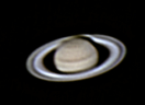
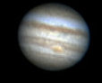
If you click the picture to the right to enlarge it, you will be able to see that the black peak tails away to the right but never entirely fades out. It continues along the right hand part of the histogram to the end, where there is a tiny additional peak. This indicates that levels of red exist all the way to the maximum brightness, a condition known as saturation. This is not usually desirable since it means you might have lost some detail, but with deep-sky objects that range from very bright to very dim, such as the Orion Nebula shown here, it is usually unavoidable. Conversely, on the left hand side of the peak the height of the black histogram rapidly falls to zero - look at the example carefully and you will see that there are no black bars for much of the left hand side, just the grey baseline. This indicates that there are no "dark" levels of red at all, up to the first bit of black. Another way of putting it is that all of the image contains some red above that level. This is clear when you look at the image - even the supposedly dark background contains colour. |
|
|
The idea now is to "stretch" the black part of the histogram so that it fills the entire space available. In other words, the effect will be that rather than no parts of the image containing lower levels of red, some parts will (and others will still contain high levels of red, as now).
To do this we adjust the "black point" - the small triangle below the histogram on the left hand side. Drag it to the right until it appears just before the point where the black bars begin. What you are doing is saying "make the left hand appear here". | |
|
|
This example (now showing the Blue channel) shows this having been done. Additionally, in the case of the blue, you will notice that the right-hand side of the histogram didn't reach all the way to the end, so the right-hand triangle (the "white point" was dragged down slightly too. It is important not to overdo the amounts by which the black and white points are moved, otherwise detail in the image can be lost. Any details with pixel values to the left of the black point, and any to the right of the white point, will be lost from the resulting image. |
|
As you move the triangles representing the black and the white points, you will notice the image changing to indicate the effect you are having. Set the points for each colour, choosing Red, Green, and blue in the drop-down control at the top of the window.
When you have set the black and white points as you like them, click the OK button to apply the changes to the image. The picture on the right shows the effect after adjusting all three colour channels. As you can see, the contrast has improved and the background is darker. There is still work to be done, though! You may use the File->Save or Save As menu option to save the image if you want a safe copy of your work so far. |

|
< PREVIOUS |
NEXT > |
|
|
|
 |
|
| All text and images copyright and may not be used without permission |
|


